The problem
A common problem with insurance quote pages is that they start off straightforward and simple. But as they mature, business, legal, and user requirements add weight and bloat to a page that ends up serving too many (and sometimes conflicting) interests.
In this design exercise, I looked at ways to improve the insurance quote page when it buckles under the stress of those variables..
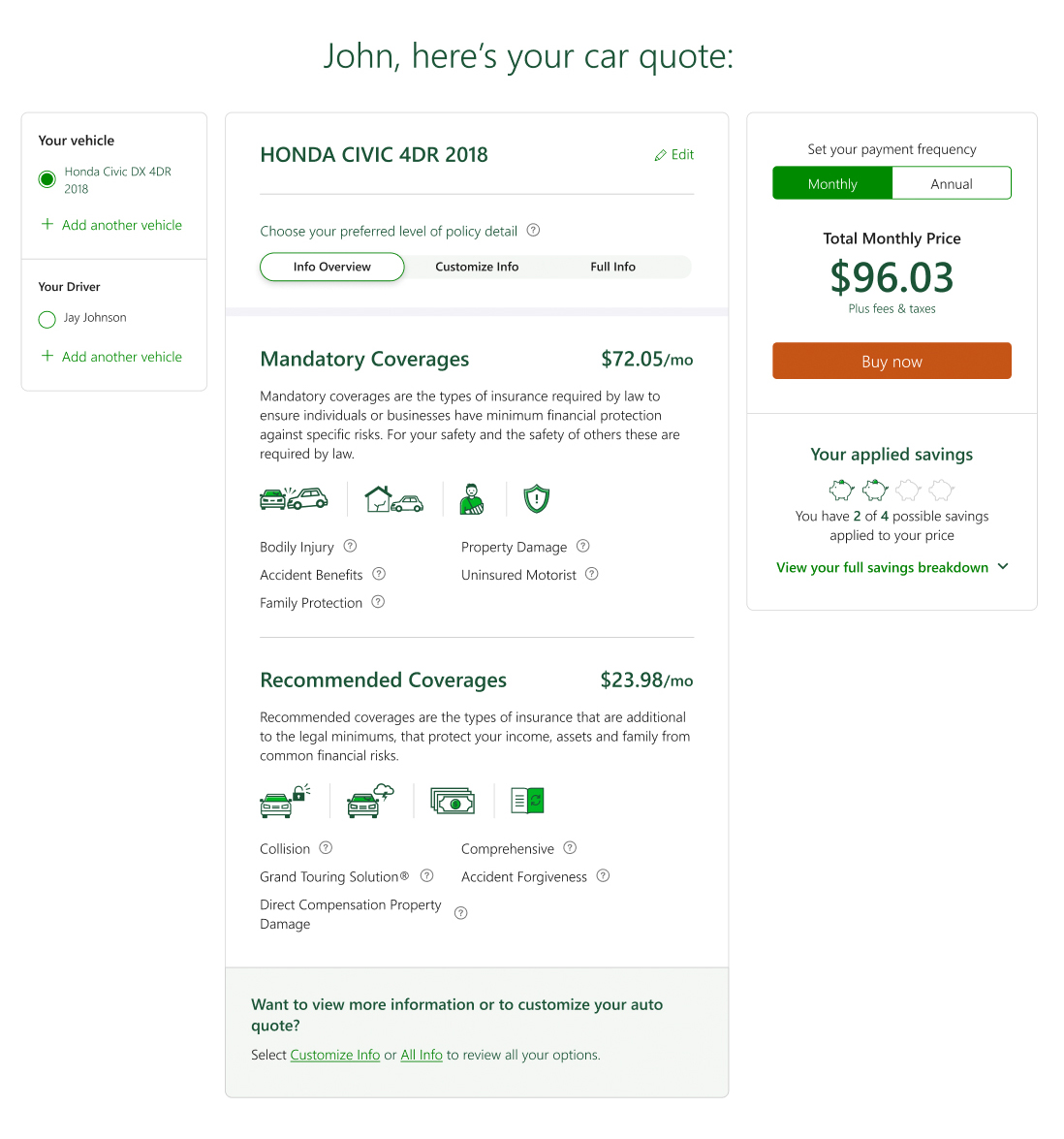
Using an auto insurance example, I identified three key areas to rethink: the price and savings section (Fig.1), adding multiple vehicles and drivers (Fig.2), and the presentation of coverages (Fig.3).
A solution
The solution presented here compartmentalizes each section and lets users determine their own priority of attention.
The three-column layout opens with driver and vehicle filtering on the left, coverages in the middle (with an added filtering layer explained below), and price and savings contained together on the right.
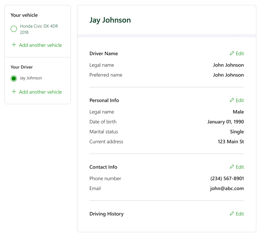
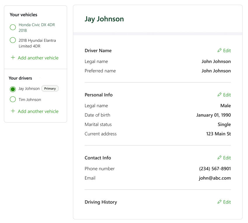
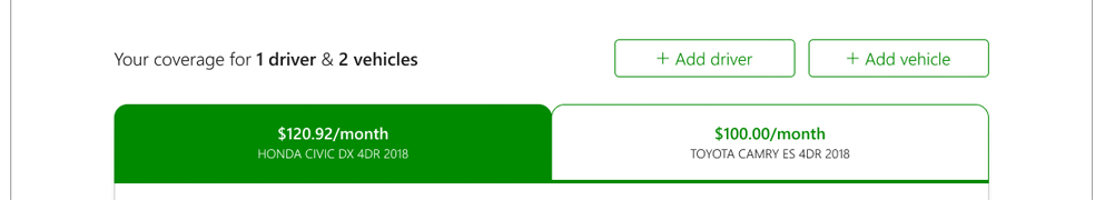
Adding driver & vehicles
Pulling the list of vehicles and drivers, along with the ability to add more, into its own card makes it a logical first step, as it's the top-level filter for the page.
In Figs.5–6, the middle column reflects the selected driver's information, while Fig.4 shows vehicle coverage when a vehicle is selected. The option to add a driver or vehicle sits cleanly at the bottom of the card, within the proper hierarchy.
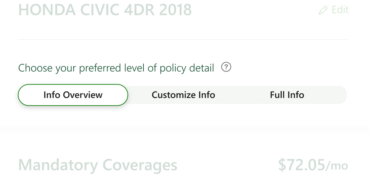
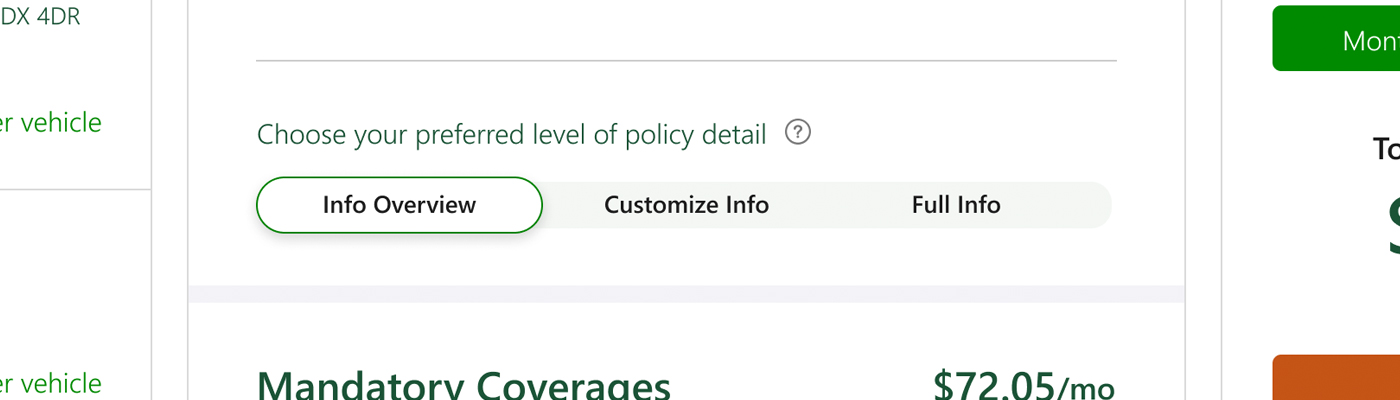
Customizable
The coverages section is the largest change…and the namesake of this case study.
Previously, customers had no choice but to navigate whatever level of detail was served to them, regardless of their insurance knowledge. This redesign puts that control in the user's hands, letting them filter content to a low, medium, or high level of detail based on their comfort.
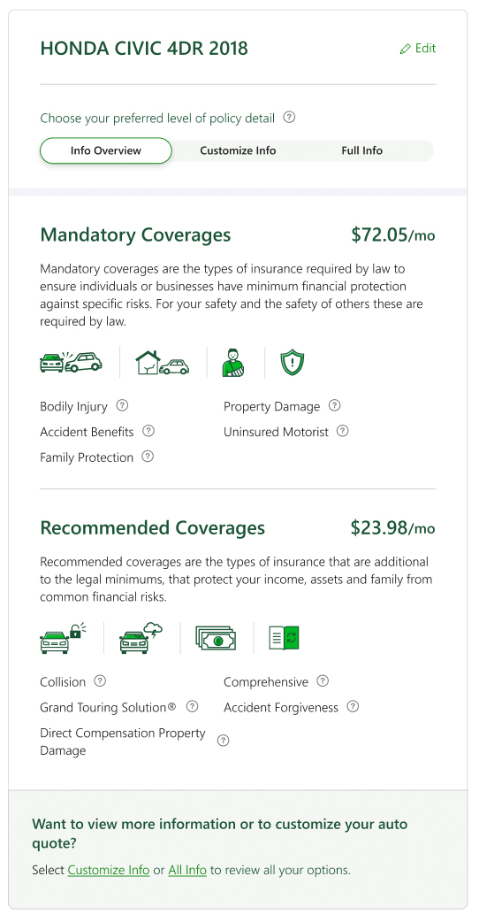
Low
A simple listing of coverages showing overall costs and protection. Users can dig deeper through tooltips or adjust their view using the policy-level detail controls.
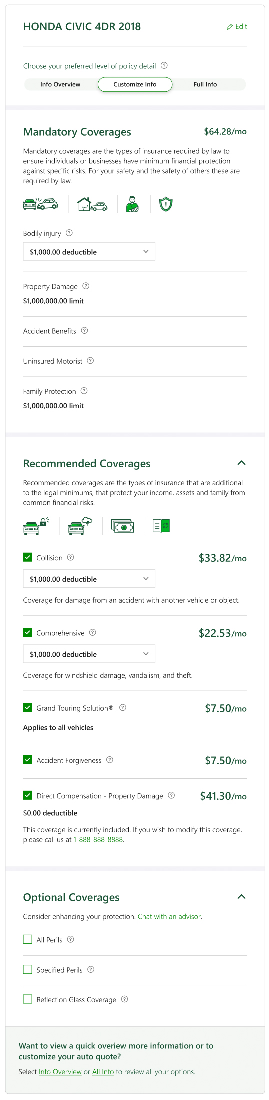
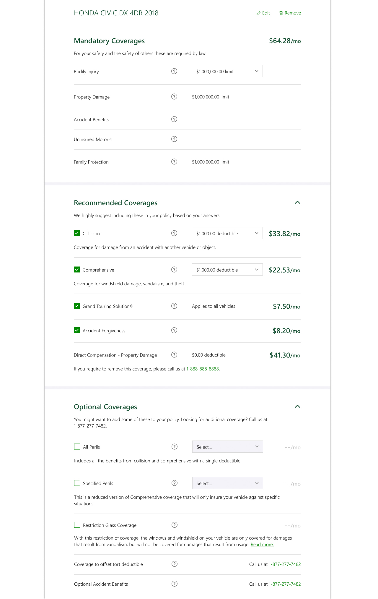
Medium
Closer to the original experience. Individual coverages are listed as line items with prices, users can adjust limits and deductibles, and additional context is available via tooltips.
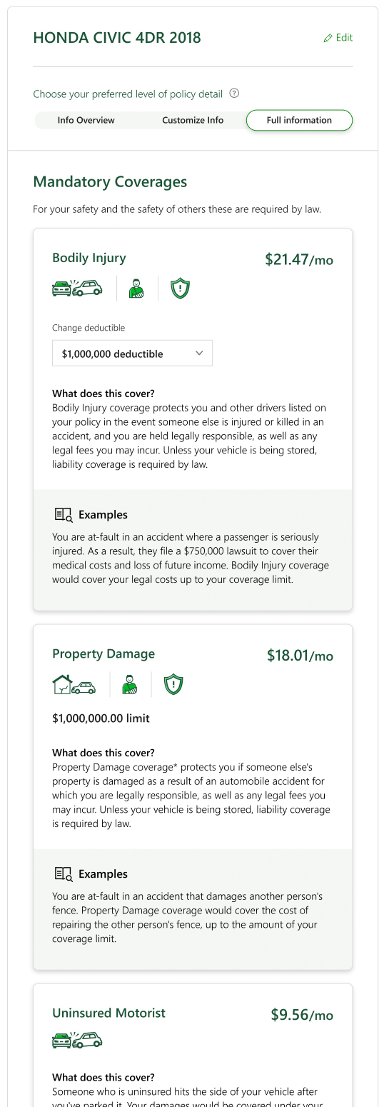
High
Everything surfaced upfront, specific coverage prices, limit and deductible controls, and all tooltip context displayed inline.
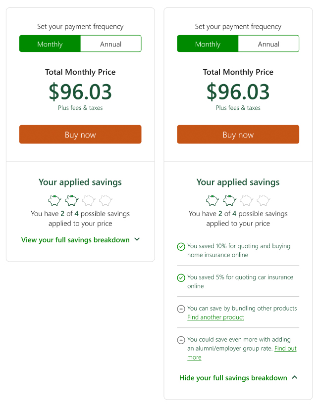
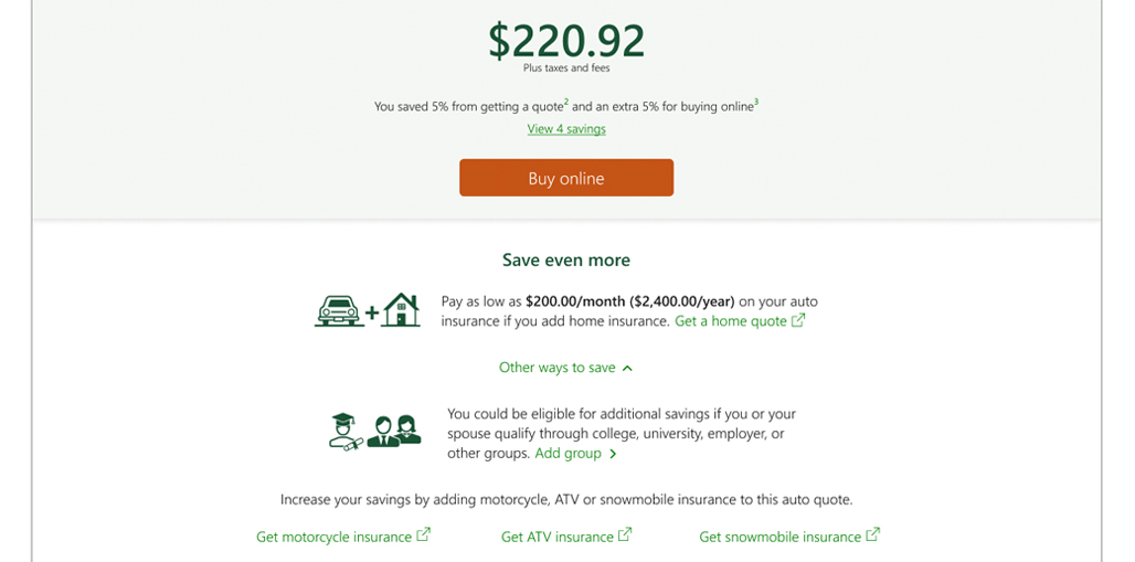
Price and savings
Grouping price and savings into their own card (rather than sandwiching them between other content, as in Fig.1) adds clarity and makes the relationship between the two more apparent.
The price section is largely unchanged. The savings section has two upgrades: first, it surfaces the user's current savings amount alongside an indicator that more savings are available, a feedback and upsell mechanism that encourages further exploration. Second, the expanded view breaks down applied savings and highlights where additional savings can be found.